Attendance Management HRMS
This case study covers the comprehensive research and design of a fully functional, mobile-optimized Payroll Management system for employees implementing at Ayekart Fintech, based in Pune.
Mobile-Optimized Integration +Designing
Role
UX/UI Designer
Focus Group
EMPLOYEES
Timeline
4 WEEKS
TOOLS
Figma
I was assigned a small role in designing screens for the attendance management and dashboard↗ in the HRMS application, focusing on the employee's perspective. This case study highlights the process of transforming the existing responsive attendance management into a mobile-optimized design.
Identifying the Cause
The attendance management needs to be mobile optimized to a single screen rather than having multiple screens. Below are some of the obstacles:
CHALLENGE
Legibility
Overlapping and inconsistent text reduced readability, making content challenging to follow and difficult to understand clearly.
Legibility
Overlapping and inconsistent text reduced readability, making content challenging to follow and difficult to understand clearly.
Organized data
Data is distributed across three screens with a horizontally scrolling table.
Organized data
Data is distributed across three screens with a horizontally scrolling table.
Visual hierarchy
Too much text can lead to visual strain, making content harder to read and reducing user engagement.
Visual hierarchy
Too much text can lead to visual strain, making content harder to read and reducing user engagement.
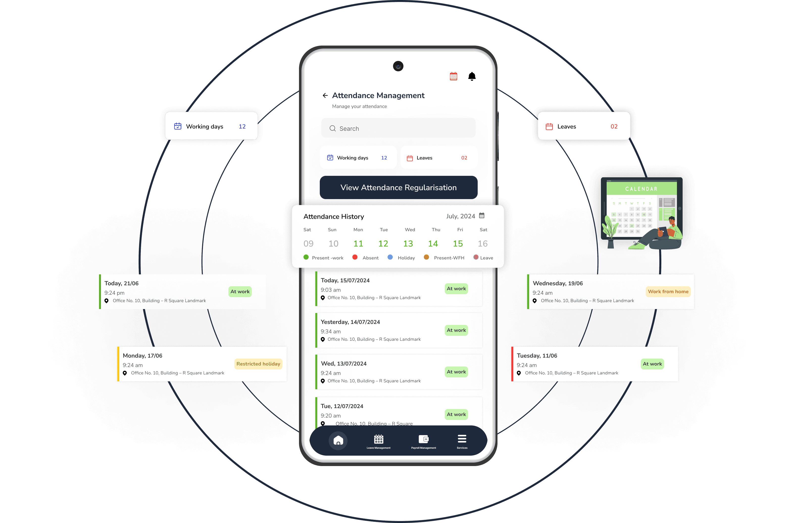
Understanding Key Parameters
Conducting a detailed analysis of the employee attendance management overview and aligning it with existing challenges was crucial to uncovering new opportunities.
CONTEXTUAL RESEARCH
i) Employee attendance management parameter understanding

Ensuring Consistent Style Across Screens
As I was simultaneously working on the dashboard, the style guide was finalized while some inspirations were taken to ensure consistency across both screens, as they are part of the HRMS.
Style Guide
i) Design system + screens of HRMS application

Developing High-Fidelity Screens
High-fidelity screens were developed to provide a clear vision of the final design, facilitating an effective visualization of the user experience. These screens then underwent an iterative process to refine details and align with user needs.
Iterations
i) Progressive Iterations of micro elements in screen

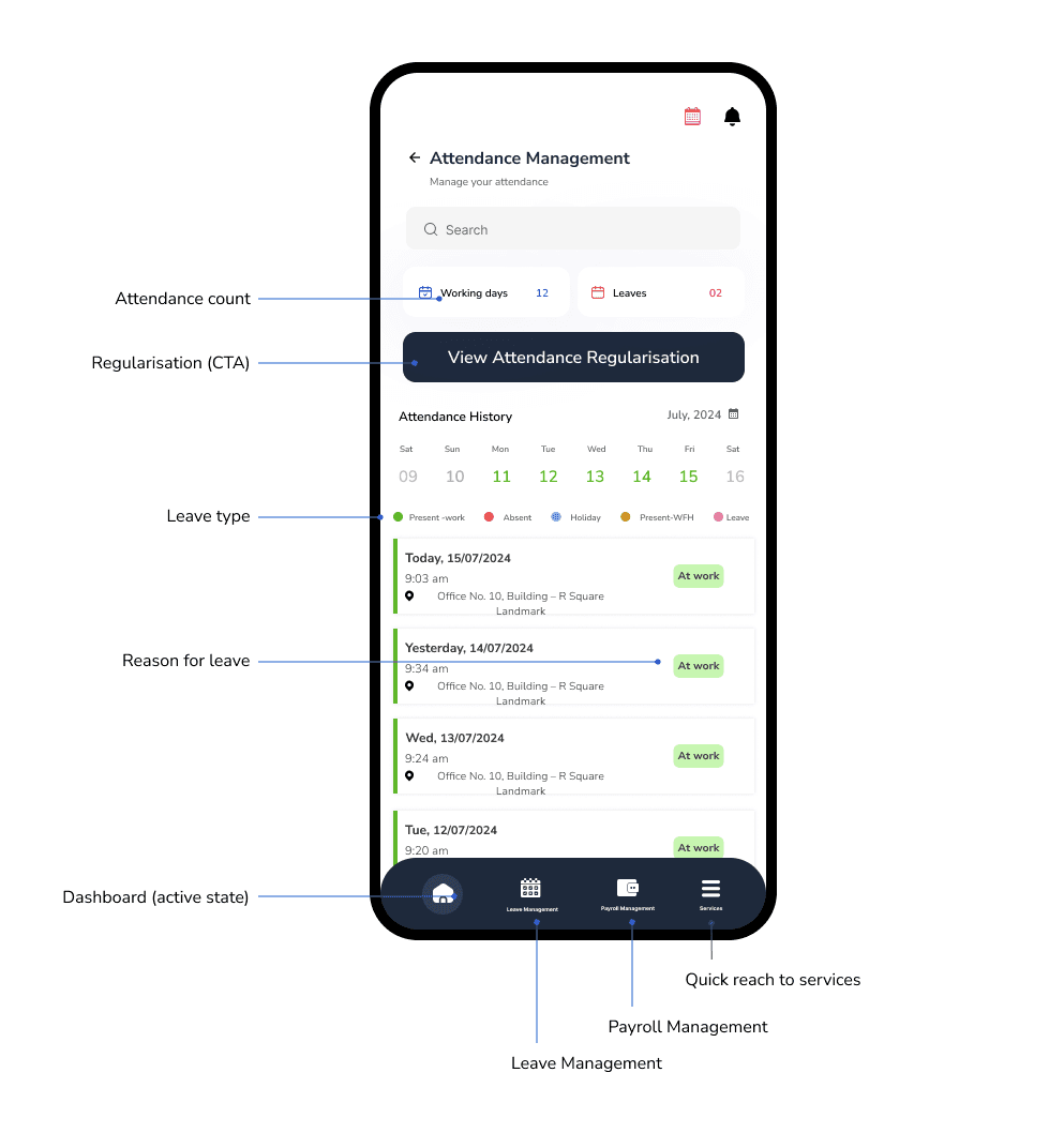
Incorporating Feedback for Enhanced User Experience
The team provided additional screens, which were incorporated alongside existing designs. Key elements were highlighted within these screens to focus on areas that would improve the overall user experience.
Improvements
i) Highlighted elements for at creating attendance management screen

Improved Experiences concepts
The team provided additional screens, which were incorporated alongside existing designs. Key elements were highlighted within these screens to focus on areas that would improve the overall user experience.
conceptualization +
Final screen
i) Design conceptualization of attendance management screen
Having previously worked on the dashboard HRMS, this project progressed quickly. While I learned about categorizing various leave reasons, the small mobile screen posed a constraint. However, the company had clear requirements, allowing this case study to be wrapped up swiftly as I transitioned to the next project : payroll management↗.
reflection
Mobile-Optimized + Redesigning
Mobile-Optimized + Redesigning
Attendance Management HRMS
Attendance Management HRMS
Attendance Management HRMS
This case study centers on redesigning the attendance management, in the HRMS for employees at Ayekart Fintech, Pune.
Role
UX/UI Designer
Focus Group
EMPLOYEES
Timeline
1 WEEKS
TOOLS
Figma
I was assigned a small role in designing screens for the attendance management and dashboard↗ in the HRMS application, focusing on the employee's perspective. This case study highlights the process of transforming the existing responsive attendance management into a mobile-optimized design.
Identifying the Cause
The attendance management needs to be mobile optimized to a single screen rather than having multiple screens. Below are some of the obstacles:
CHALLENGE
Legibility
Overlapping and inconsistent text reduced readability, making content challenging to follow and difficult to understand clearly.
Legibility
Overlapping and inconsistent text reduced readability, making content challenging to follow and difficult to understand clearly.
Organized data
Data is distributed across three screens with a horizontally scrolling table.
Organized data
Data is distributed across three screens with a horizontally scrolling table.
Visual hierarchy
Too much text can lead to visual strain, making content harder to read and reducing user engagement.
Visual hierarchy
Too much text can lead to visual strain, making content harder to read and reducing user engagement.
CONTEXTUAL RESEARCH
Understanding Key Parameters
Conducting a detailed analysis of the employee attendance management overview and aligning it with existing challenges was crucial to uncovering new opportunities.
i) Employee attendance management parameter understanding
CHALLENGE
Identifying the Cause
The attendance management needs to be mobile optimized to a single screen rather than having multiple screens. Below are some of the obstacles:
Legibility
Overlapping and inconsistent text reduced readability, making content challenging to follow and difficult to understand clearly.
Organized data
Data is distributed across three screens with a horizontally scrolling table.
Visual hierarchy
Too much text can lead to visual strain, making content harder to read and reducing user engagement.
Style Guide
Ensuring Consistent Style Across Screens
As I was simultaneously working on the dashboard, the style guide was finalized while some inspirations were taken to ensure consistency across both screens, as they are part of the HRMS.
i) Design system + screens of HRMS application
CONTEXTUAL RESEARCH
Understanding Key Parameters
Conducting a detailed analysis of the employee attendance management overview and aligning it with existing challenges was crucial to uncovering new opportunities.
i) Employee attendance management parameter understanding
Iterations
Iterations
Developing High-Fidelity Screens
High-fidelity screens were developed to provide a clear vision of the final design, facilitating an effective visualization of the user experience. These screens then underwent an iterative process to refine details and align with user needs.
i) Progressive Iterations of micro elements in screen
Improvements
Incorporating Feedback for Enhanced User Experience
The team provided additional screens, which were incorporated alongside existing designs. Key elements were highlighted within these screens to focus on areas that would improve the overall user experience.
i) Highlighted elements for at creating attendance management screen
conceptualization + Final screen
Improved Experiences concepts
All elements along the screen were highlighted, applying design principles to improve the overall user experience. This approach aimed to create a more intuitive and engaging interface.
i) Design conceptualization of attendance management screen
conceptualization + Final screen
Identifying the Cause
The attendance management needs to be mobile optimized to a single screen rather than having multiple screens. Below are some of the obstacles:
CHALLENGE
Legibility
Overlapping and inconsistent text reduced readability, making content challenging to follow and difficult to understand clearly.
Legibility
Overlapping and inconsistent text reduced readability, making content challenging to follow and difficult to understand clearly.
Organized data
Data is distributed across three screens with a horizontally scrolling table.
Organized data
Data is distributed across three screens with a horizontally scrolling table.
Visual hierarchy
Too much text can lead to visual strain, making content harder to read and reducing user engagement.
Visual hierarchy
Too much text can lead to visual strain, making content harder to read and reducing user engagement.
Ensuring Consistent Style Across Screens
As I was simultaneously working on the dashboard, the style guide was finalized while some inspirations were taken to ensure consistency across both screens, as they are part of the HRMS.
Style Guide
i) Design system + screens of HRMS application
Developing High-Fidelity Screens
High-fidelity screens were developed to provide a clear vision of the final design, facilitating an effective visualization of the user experience. These screens then underwent an iterative process to refine details and align with user needs.
Iterations
i) Progressive Iterations of micro elements in screen
Incorporating Feedback for Enhanced User Experience
The team provided additional screens, which were incorporated alongside existing designs. Key elements were highlighted within these screens to focus on areas that would improve the overall user experience.
Improvements
i) Highlighted elements for at creating attendance management screen
Improved Experiences concepts
All elements along the screen were highlighted, applying design principles to improve the overall user experience. This approach aimed to create a more intuitive and engaging interface.
conceptualization + Final screen
i) Design conceptualization of attendance management screen
Having previously worked on the dashboard HRMS, this project progressed quickly. While I learned about categorizing various leave reasons, the small mobile screen posed a constraint. However, the company had clear requirements, allowing this case study to be wrapped up swiftly as I transitioned to the next project : payroll management↗.
reflection
reflection