Dashboard HRMS
This case study examines the redesign of the HRMS dashboard at Ayekart Fintech, Pune, aiming to boost user engagement and streamline access to key features.
Mobile-Optimized + REDesigning
Role
UX/UI Designer
Focus Group
EMPLOYEES
Timeline
4 WEEKS
TOOLS
Figma
During my internship, my project centered on mobile-optimizing an HRMS application for employees. My primary focus was designing and integrating a payroll management system, while other projects were creating dashboard↗ and attendance management system↗ geared towards administrative functions.
PROBLEM
Addressing the pain points
The dashboard screen below is designed to be responsive and mobile-optimized. However, it currently faces several pain points, including excessive scrolling, overwhelming data, difficult navigation, and a lack of visual appeal.
i) Old dashboard HRMS screen
Decoding the obstacles
As we all know, first impressions are crucial. The dashboard, being the initial screen users encounter, faces several issues that must be addressed. Below are the most common issues that are lacking:
Desires
Intuitive
A clean well-organized navigation, and consistent design allowing seemless flow ensuring users to easily find relevant features across the interface.
Intuitive
A clean well-organized navigation, and consistent design allowing seemless flow ensuring users to easily find relevant features across the interface.
Data Management
Presenting all information clearly on a single screen without overwhelming the user, balancing both detail and simplicity.
Data Management
Presenting all information clearly on a single screen without overwhelming the user, balancing both detail and simplicity.
Visual hierarchy
Key information, such as targets, achievements, or updates, must be clearly defined so users can easily prioritize tasks, even on small mobile screens.
Visual hierarchy
Key information, such as targets, achievements, or updates, must be clearly defined so users can easily prioritize tasks, even on small mobile screens.
Role of Dashboard in HRMS
Even with a foundational understanding of the HRMS dashboard, it was necessary to revisit and clarify the specific context to ensure alignment with project goals. This step helped to refine the approach and address any unique requirements.
CONTEXTUAL RESEARCH
i) Brainstorming to explore and understand the topic

Designing the Appearance
Given the tentative nature of the requirement, I immediately began creating an inspiration board to meet the end-of-day deadline.
Inspirational board
i) Inspiration board of applications
Dashboard Iterations Progress
Below are the iterations of the dashboard screen completed within the deadline, with each version showcasing the progress made through informed decisions.
Iterations
i) Progressive Iterations of dashboard screen

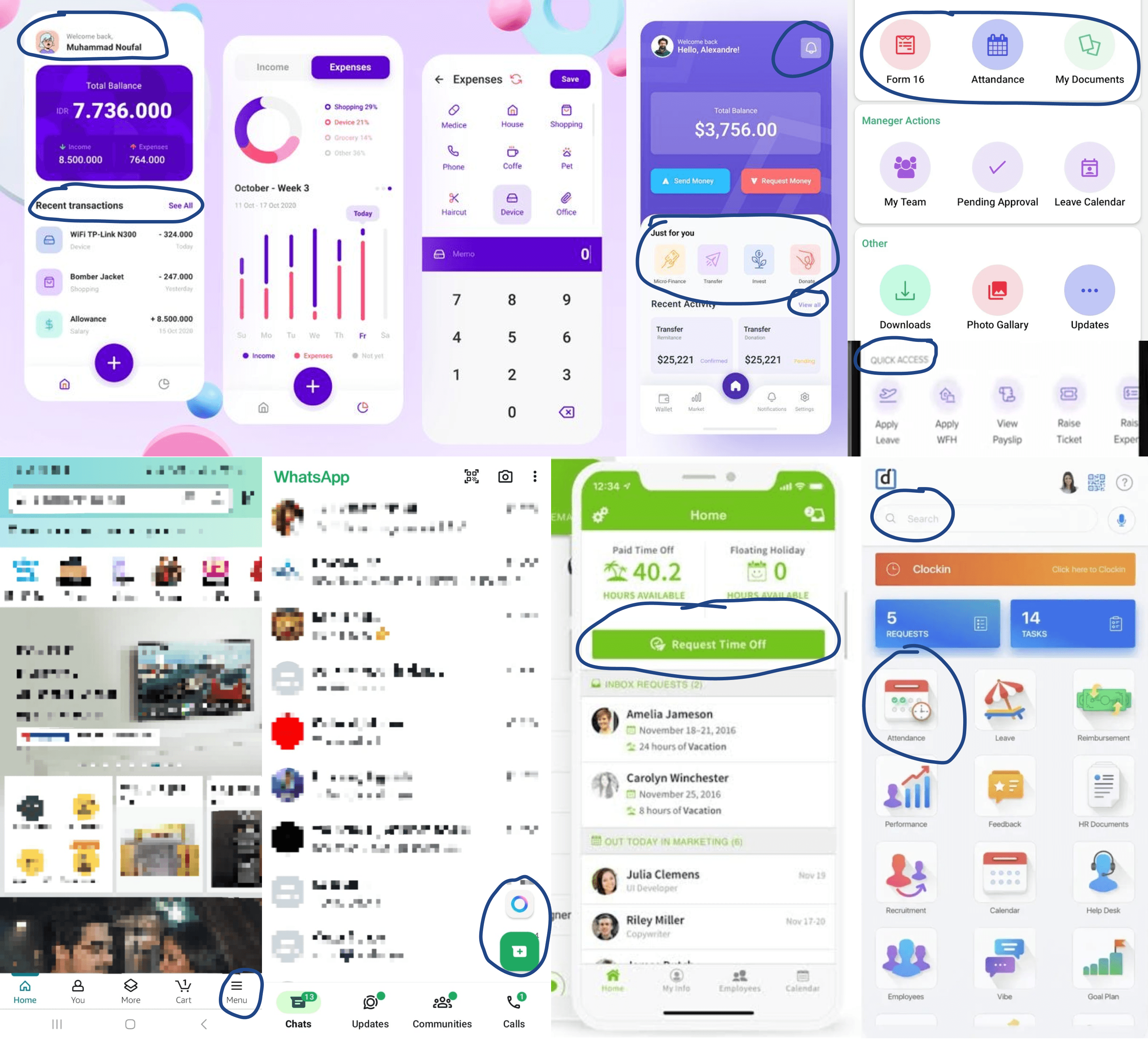
User-Centric Design Inspiration
Highlighting Screen Elements to Capture User Essence Inspired by Leading Applications like WhatsApp and Amazon, Competitors such as BambooHR, Keka, and Darwinbox, and Other Influential Apps.
Inspirational board
i) Highlighted elements from competitor's screen for inspiration
Streamlined Experiences for Enhanced Usability
Arrange the elements in a chronological order based on usability, ensuring consistency and a visually appealing layout throughout the screen.This approach will guide the design to flow intuitively while maintaining a polished and cohesive look.
Iterations
i) Changes in layout of the screens

Dashboard recreation
The Urgent Dashboard Prototyping Requirement company urgently required a high-fidelity final screen of the dashboard for prototyping, as it provides an overview of all HRMS functions.
Emergent need
User-Friendly Applications
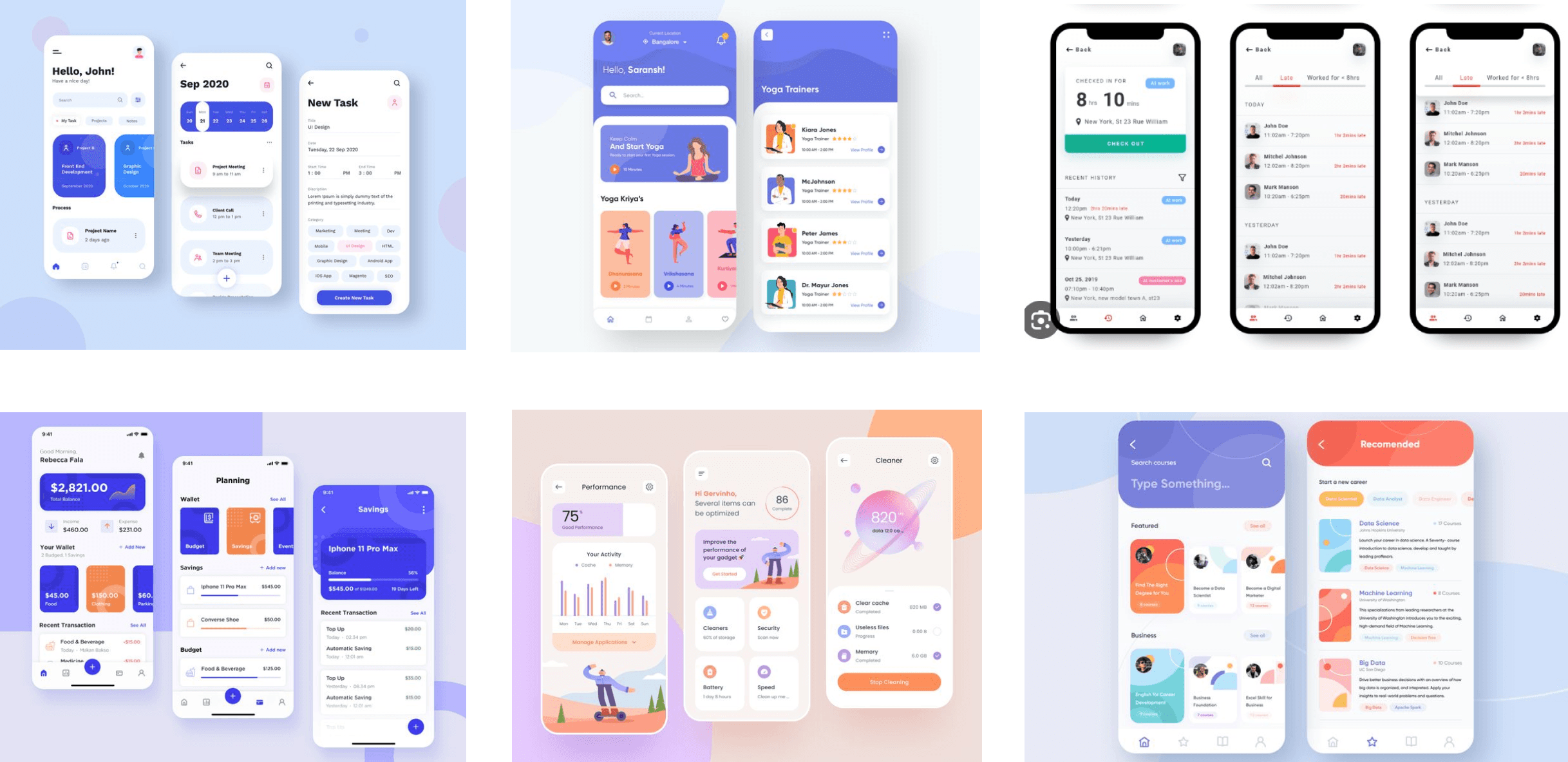
HRMS is a complex platform, and while mobile usage is growing, it often isn't the primary focus. Therefore, optimization beyond mere responsiveness is essential. Below are competitors featuring user-friendly dashboards in the most-used HRMS mobile applications.
Competitor Analysis
i) Competitor analysis of mobile-friendly applications
Working Toward Improvement
After several iterations to determine the appropriate mood for the requirements, the design system, including the color palette and typeface, was finalized. However, the screen still needed improvements in user experience. To enhance the design, the team referred to take inspiration from competitors like Keka, Darwin, and other user-friendly mobile applications. They extended the timeline to focus on the dashboard, with a one-week completion goal, outlining key requirements:
• Minimize scrolling
• Add punch-in feature for attendance
• Ensure quick access and updates
• Restore visual appeal
Discussion

i) Design system + screens of HRMS application
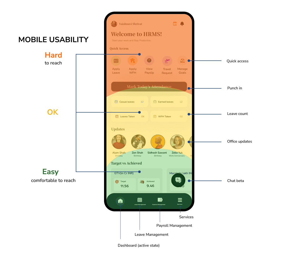
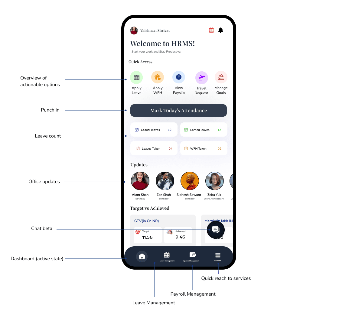
Optimized Dashboard for Seamless Mobile Usability
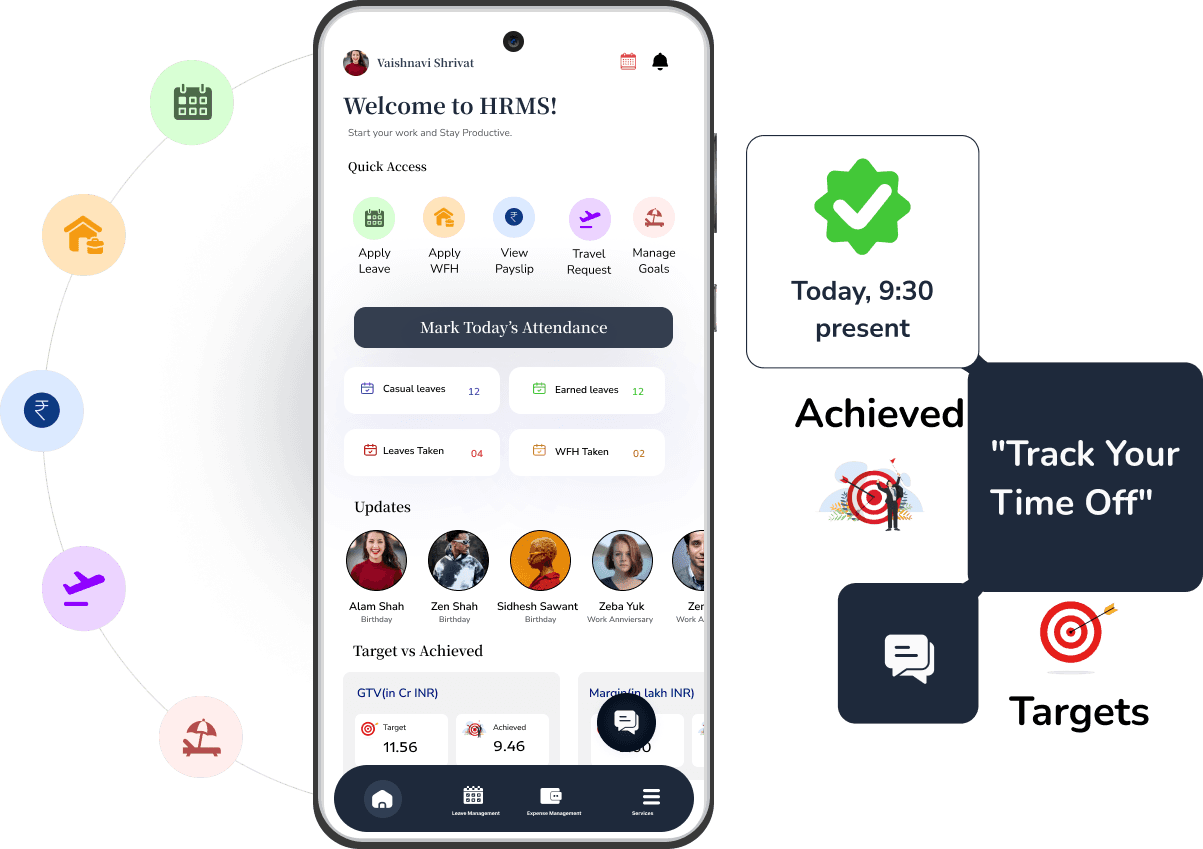
Dashboard screens are thoughtfully conceptualized and finalized, with parameters arranged to prioritize mobile usability and create a seamless, easy experience.
conceptualization +
Final screen
i) Mobile Usability evaluation
i) Design conceptualization of dashboard screen
The dashboard, my first real-life project, seemed simple at first glance but proved challenging, revealing the intricacies of a complex SaaS platform. This case study was instrumental in helping me build skills that I later applied to other projects, including attendance management↗ and payroll management↗ .
reflection
PROBLEM
Addressing the pain points
The dashboard screen below is designed to be responsive, but it isn't mobile-optimized. However, it currently faces several pain points, including excessive scrolling, overwhelming data, difficult navigation, and a lack of visual appeal.
i) Old dashboard HRMS screen
Mobile-Optimized + Redesigning
Mobile-Optimized + Redesigning
Dashboard HRMS
Dashboard HRMS
This case study examines the redesign of the HRMS dashboard at Ayekart Fintech, Pune, aiming to boost user engagement and streamline access to key features.
Role
UX/UI Designer
Focus Group
EMPLOYEES
Timeline
1 WEEKS
TOOLS
Figma
I was assigned a role in designing screens for the dashboard and attendance management in the HRMS application, focusing on the employee's perspective. This case study highlights the process of transforming the existing responsive dashboard into a mobile-optimized design.
PROBLEM
Addressing the pain points
The dashboard screen below is designed to be responsive, but it isn't mobile-optimized. However, it currently faces several pain points, including excessive scrolling, overwhelming data, difficult navigation, and a lack of visual appeal.
i) Old dashboard HRMS screen
Decoding the obstacles
As we all know, first impressions are crucial. The dashboard, being the initial screen users encounter, faces several issues that must be addressed. Below are the most common issues that are lacking:
Desires
Intuitive
A clean well-organized navigation, and consistent design allowing seemless flow ensuring users to easily find relevant features across the interface.
Intuitive
A clean well-organized navigation, and consistent design allowing seemless flow ensuring users to easily find relevant features across the interface.
Data Management
Presenting all information clearly on a single screen without overwhelming the user, balancing both detail and simplicity.
Data Management
Presenting all information clearly on a single screen without overwhelming the user, balancing both detail and simplicity.
Visual hierarchy
Key information, such as targets, achievements, or updates, must be clearly defined so users can easily prioritize tasks, even on small mobile screens.
Visual hierarchy
Key information, such as targets, achievements, or updates, must be clearly defined so users can easily prioritize tasks, even on small mobile screens.
Desires
Decoding the obstacles
As we all know, first impressions are crucial. The dashboard, being the initial screen users encounter, faces several issues that must be addressed. Below are the most common issues that are lacking:
Intuitive
A clean well-organized navigation, and consistent design allowing seemless flow ensuring users to easily find relevant features across the interface.
Data Management
Presenting all information clearly on a single screen without overwhelming the user, balancing both detail and simplicity.
Visual hierarchy
Key information, such as targets, achievements, or updates, must be clearly defined so users can easily prioritize tasks, even on small mobile screens.
CONTEXTUAL RESEARCH
Role of Dashboard in HRMS
Even with a foundational understanding of the HRMS dashboard, it was necessary to revisit and clarify the specific context to ensure alignment with project goals. This step helped to refine the approach and address any unique requirements.
i) Brainstorming to explore and understand the topic
Emergent need
Dashboard recreation
The Urgent Dashboard Prototyping Requirement company urgently required a high-fidelity final screen of the dashboard for prototyping, as it provides an overview of all HRMS functions.
Dashboard recreation
The Urgent Dashboard Prototyping Requirement company urgently required a high-fidelity final screen of the dashboard for prototyping, as it provides an overview of all HRMS functions.
Emergent need
Emergent need
Emergent need
Designing the Appearance
Given the tentative nature of the requirement, I immediately began creating an inspiration board to meet the end-of-day deadline.
i) Inspiration board of applications
Inspirational board
Working Toward Improvement
After several iterations to determine the appropriate mood for the requirements, the design system, including the color palette and typeface, was finalized. However, the screen still needed improvements in user experience. To enhance the design, the team referred to take inspiration from competitors like Keka, Darwin, and other user-friendly mobile applications. They extended the timeline to focus on the dashboard, with a one-week completion goal, outlining key requirements:
• Minimize scrolling
• Add punch-in feature for attendance
• Ensure quick access and updates
• Restore visual appeal
Discussion
i) Design system + screens of HRMS application
Dashboard recreation
The Urgent Dashboard Prototyping Requirement company urgently required a high-fidelity final screen of the dashboard for prototyping, as it provides an overview of all HRMS functions.
Emergent need
Streamlined Experiences for Enhanced Usability
Arrange the elements in a chronological order based on usability, ensuring consistency and a visually appealing layout throughout the screen.This approach will guide the design to flow intuitively while maintaining a polished and cohesive look.
i) Changes in layout of the screens
Iterations
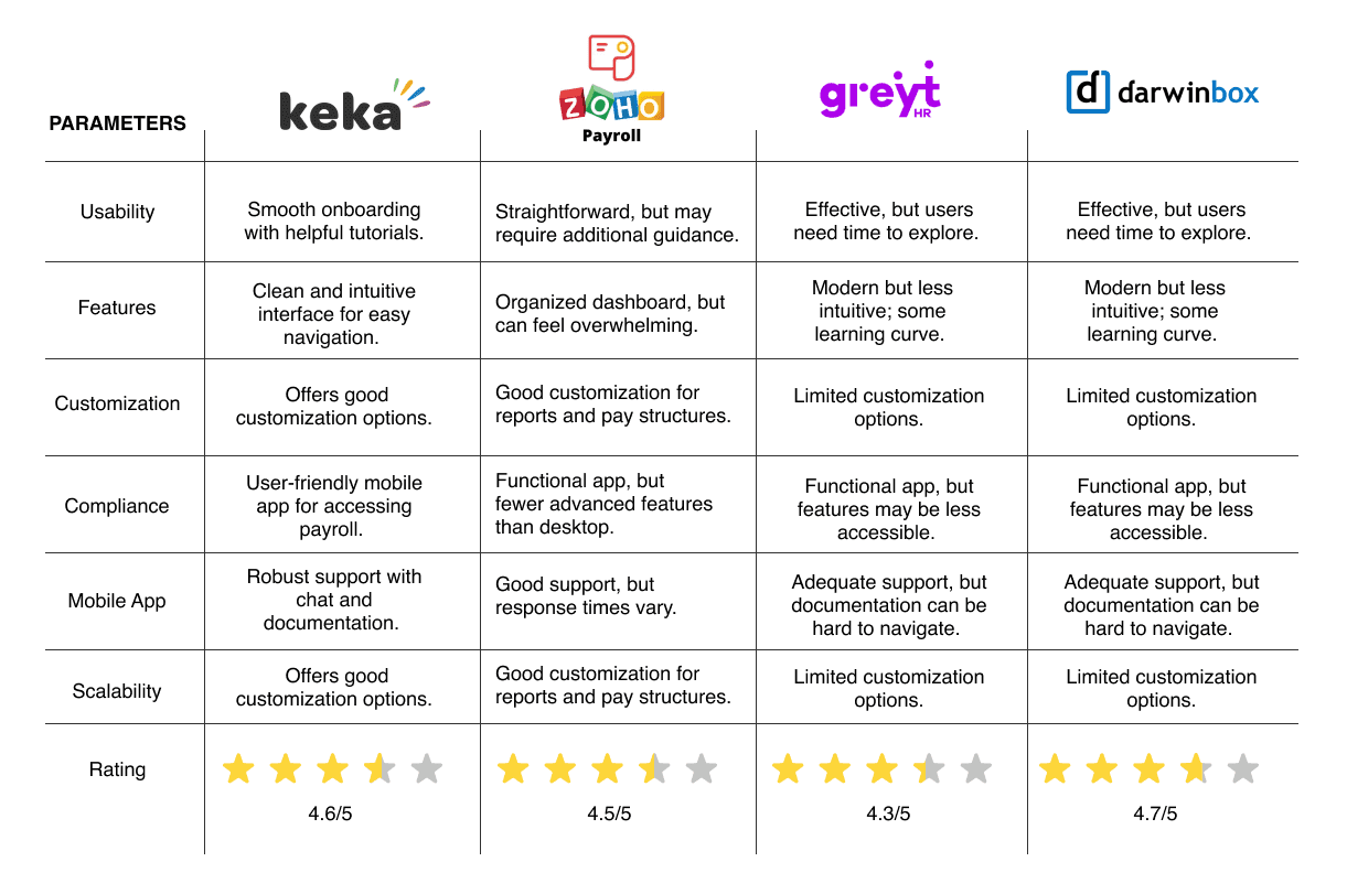
User-Friendly Applications
HRMS is a complex platform, and while mobile usage is growing, it often isn't the primary focus. Therefore, optimization beyond mere responsiveness is essential. Below are competitors featuring user-friendly dashboards in the most-used HRMS mobile applications.
i) Competitor analysis of mobile-friendly applications
Competitor Analysis
Dashboard Iterations Progress
Below are the iterations of the dashboard screen completed within the deadline, with each version showcasing the progress made through informed decisions.
i) Progressive Iterations of dashboard screen
Iterations
Iterations
Inspirational board
Designing the Appearance
User-Centric Design Inspiration
Given the tentative nature of the requirement, I immediately began creating an inspiration board to meet the end-of-day deadline.
Highlighting Screen Elements to Capture User Essence Inspired by Leading Applications like WhatsApp and Amazon, Competitors such as BambooHR, Keka, and Darwinbox, and Other Influential Apps.
i) Inspiration board of applications
i) Highlighted elements from competitor's screen for inspiration
Iterations
Dashboard Iterations Progress
Below are the iterations of the dashboard screen completed within the deadline, with each version showcasing the progress made through informed decisions.
i) Progressive Iterations of dashboard screen
Discussion + Design system
Working Toward Improvement
After several iterations to determine the appropriate mood for the requirements, the design system, including the color palette and typeface, was finalized. However, the screen still needed improvements in user experience. To enhance the design, the team referred to take inspiration from competitors like Keka, Darwin, and other user-friendly mobile applications. They extended the timeline to focus on the dashboard, with a one-week completion goal, outlining key requirements:
• Minimize scrolling
• Add punch-in feature for attendance
• Ensure quick access and updates
• Restore visual appeal
i) Design system + screens of HRMS application
Decoding the obstacles
As we all know, first impressions are crucial. The dashboard, being the initial screen users encounter, faces several issues that must be addressed. Below are the most common issues that are lacking:
Desires
Intuitive
A clean well-organized navigation, and consistent design allowing seemless flow ensuring users to easily find relevant features across the interface.
Intuitive
A clean well-organized navigation, and consistent design allowing seemless flow ensuring users to easily find relevant features across the interface.
Data Management
Presenting all information clearly on a single screen without overwhelming the user, balancing both detail and simplicity.
Data Management
Presenting all information clearly on a single screen without overwhelming the user, balancing both detail and simplicity.
Visual hierarchy
Key information, such as targets, achievements, or updates, must be clearly defined so users can easily prioritize tasks, even on small mobile screens.
Visual hierarchy
Key information, such as targets, achievements, or updates, must be clearly defined so users can easily prioritize tasks, even on small mobile screens.
Optimized Dashboard for Seamless Mobile Usability
Dashboard screens are thoughtfully conceptualized and finalized, with parameters arranged to prioritize mobile usability and create a seamless, easy experience.
i) Mobile Usability evaluation
i) Design conceptualization of dashboard screen
conceptualization + Final screen
Competitor Analysis
User-Friendly Applications
HRMS is a complex platform, and while mobile usage is growing, it often isn't the primary focus. Therefore, optimization beyond mere responsiveness is essential. Below are competitors featuring user-friendly dashboards in the most-used HRMS mobile applications.
i) Competitor analysis of mobile-friendly applications
Designing the Appearance
Given the tentative nature of the requirement, I immediately began creating an inspiration board to meet the end-of-day deadline.
Inspirational board
i) Inspiration board of applications
Inspirational board
User-Centric Design Inspiration
Highlighting Screen Elements to Capture User Essence Inspired by Leading Applications like WhatsApp and Amazon, Competitors such as BambooHR, Keka, and Darwinbox, and Other Influential Apps.
i) Highlighted elements from competitor's screen for inspiration
Iterations
Streamlined Experiences for Enhanced Usability
Arrange the elements in a chronological order based on usability, ensuring consistency and a visually appealing layout throughout the screen.This approach will guide the design to flow intuitively while maintaining a polished and cohesive look.
i) Changes in layout of the screens
Streamlined Experiences for Enhanced Usability
Arrange the elements in a chronological order based on usability, ensuring consistency and a visually appealing layout throughout the screen.This approach will guide the design to flow intuitively while maintaining a polished and cohesive look.
Iterations
i) Changes in layout of the screens
conceptualization + Final screen
Optimized Dashboard for Seamless Mobile Usability
Dashboard screens are thoughtfully conceptualized and finalized, with parameters arranged to prioritize mobile usability and create a seamless, easy experience.
i) Mobile Usability evaluation
i) Design conceptualization of dashboard screen
Dashboard Iterations Progress
Below are the iterations of the dashboard screen completed within the deadline, with each version showcasing the progress made through informed decisions.
Iterations
i) Progressive Iterations of dashboard screen
Working Toward Improvement
After several iterations to determine the appropriate mood for the requirements, the design system, including the color palette and typeface, was finalized. However, the screen still needed improvements in user experience. To enhance the design, the team referred to take inspiration from competitors like Keka, Darwin, and other user-friendly mobile applications. They extended the timeline to focus on the dashboard, with a one-week completion goal, outlining key requirements:
• Minimize scrolling
• Add punch-in feature for attendance
• Ensure quick access and updates
• Restore visual appeal
Discussion
i) Design system + screens of HRMS application
User-Centric Design Inspiration
Highlighting Screen Elements to Capture User Essence Inspired by Leading Applications like WhatsApp and Amazon, Competitors such as BambooHR, Keka, and Darwinbox, and Other Influential Apps.
Inspirational board
i) Highlighted elements from competitor's screen for inspiration
Optimized Dashboard for Seamless Mobile Usability
Dashboard screens are thoughtfully conceptualized and finalized, with parameters arranged to prioritize mobile usability and create a seamless, easy experience.
conceptualization + Final screen
i) Mobile Usability evaluation
i) Design conceptualization of dashboard screen
User-Friendly Applications
HRMS is a complex platform, and while mobile usage is growing, it often isn't the primary focus. Therefore, optimization beyond mere responsiveness is essential. Below are competitors featuring user-friendly dashboards in the most-used HRMS mobile applications.
Competitor Analysis
i) Competitor analysis of mobile-friendly applications
The dashboard, my first real-life project, seemed simple at first glance but proved challenging, revealing the intricacies of a complex SaaS platform. This case study was instrumental in helping me build skills that I later applied to other projects, including attendance management↗ and payroll management↗ .
reflection
reflection